Choosing the right wall art can transform a room, creating harmony with your existing furniture. Renowned interior designer, Julia Morgan, emphasizes, "Art should reflect the surroundings, creating a cohesive feel." This quote serves as a reminder of the importance of balancing colors and styles.
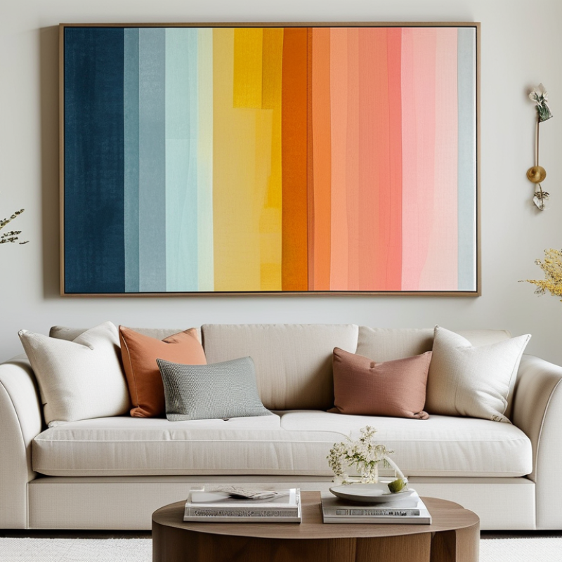
When considering how to select wall art that matches furniture color, think about the tones in your space. If your furniture features muted shades, vibrant art can add energy. Conversely, if you have bold furniture, softer art can provide relief. Pay attention to the emotional connection you want to create.
Reflecting on your choices is vital. Choosing art is subjective, and it may not always align perfectly with your furniture. Don't rush this process. Take your time to curate pieces that resonate with you, ensuring they enhance the overall aesthetic. Remember, the right wall art should evoke feelings and complement your home, making it a true reflection of your personality.
The color wheel is a vital tool for selecting wall art. Understanding it helps create a harmonious interior. Key concepts include complementary and analogous colors. Complementary colors are opposite on the wheel, while analogous colors sit next to each other. Using these principles enhances visual appeal.
Research shows that 65% of homeowners prioritize wall art when decorating. The right art can elevate a room’s feel. It often reflects personal style. However, mismatched colors can lead to an unbalanced aesthetic. Many people struggle with using the color wheel effectively, resulting in artwork that distracts rather than complements.
Consider your furniture’s main colors. If you have warm tones, look for art with soft oranges or muted yellows. Conversely, cool-toned furniture pairs well with blues and greens. The right choice fosters a calming atmosphere. Yet, many overlook these guidelines and end up feeling dissatisfied. It’s essential to reflect on your selections and their impact on the overall design.
When selecting wall art, understanding your furniture color scheme is crucial. It acts as a guide, influencing the vibe of your room. Analyzing the dominant colors in your furniture helps identify ideal wall art options. For instance, if your furniture features earthy tones, consider artwork with natural hues. This creates a seamless look, enhancing the overall atmosphere.
Contrasting colors can also bring excitement. A bright piece can stand out against neutral furniture. However, balance is key. Too much contrast may feel jarring. Instead, choose art that includes accents of your furniture's color. This can tie the room together harmoniously. Pay attention to the undertones, too. Warmer tones in art complement warmer furniture shades effectively.
Experimenting is essential in this process. Don’t settle for the first choice. Try various placements and styles. Observe how different pieces make you feel. It's okay if it takes time to find the perfect match. Seeking advice from friends or design professionals can be beneficial. Trust your instincts; they can help you create a cohesive space that feels uniquely yours.
| Furniture Color | Best Wall Art Colors | Recommended Art Styles | Tips for Matching |
|---|---|---|---|
| White | Pastels, Bright Colors | Abstract, Photography | Choose vibrant art to add contrast and life. |
| Grey | Bold Colors, Silver | Modern, Minimalist | Use art with strong contrasts for a pop of interest. |
| Brown | Earthy Tones, Greens | Nature Themes, Rustic | Opt for artworks that highlight natural textures. |
| Blue | Cool Tones, White | Seascapes, Abstract | Choose complementary colors to maintain harmony. |
| Beige | Warm Colors, Deep Hues | Classic, Vintage | Incorporate art that adds warmth without overwhelming. |
Choosing wall art that complements your furniture color can significantly impact the overall feel of your space. When considering color schemes, two key concepts emerge: complementary and analogous colors. Complementary colors are those that sit opposite each other on the color wheel, while analogous colors are next to each other. Understanding these relationships can be crucial for achieving harmony in your room.
Complementary colors can create a vibrant contrast. For example, if your furniture is a muted blue, art featuring warm oranges can energize the space. But overdoing it might lead to a chaotic feel. Perhaps a subtle touch of orange would be better. Conversely, using analogous colors promotes a smoother look. A green couch may pair beautifully with art in shades of teal and yellow-green. This can evoke a more serene atmosphere. However, one must be careful; too much of a similar hue can lack interest.
Textures and patterns also play a crucial role in how colors communicate. A piece with varied textures can break the monotony of similar color families. In contrast, a flat painting might seem lifeless against a dynamic furniture piece. Ultimately, experimenting with different combinations is essential. Trust your instincts, but also reflect on the balance of colors in your choices. Your space should feel inviting yet sophisticated.
When selecting wall art, understanding color pairings with furniture styles is essential. Recent studies indicate that homeowners prefer cohesive color schemes. Nearly 70% of decorators recommend matching wall art to furniture tones for a harmonious look.
For example, if your furniture features earthy tones like browns or greens, consider artwork showcasing nature scenes or abstract designs with similar hues. This approach not only enhances the room's aesthetic but creates a calming atmosphere. Conversely, bold furniture colors demand striking art pieces. Consider artwork that contrasts yet complements these bold choices to add depth.
Tips: Think about texture when selecting art. Mixed media can offer an interesting contrast to sleek furniture. Additionally, consider scale; oversized art can create a strong focal point, while smaller pieces can be grouped for a gallery effect. Reflect on how different colors evoke emotions; the right pairing can enhance your space's overall vibe significantly.
Color plays a pivotal role in our perception of art and interior design. Research indicates that 85% of consumers make purchasing decisions based on color. This statistic shows how critical color harmony is in an environment. When selecting wall art, consider how it complements or contrasts with your furniture. Warm colors like red and yellow can evoke energy and excitement, while cooler tones create calm and relaxation.
The psychological effects of color extend beyond aesthetic appeal. A study by the University of Maryland revealed that blue artwork can enhance creativity and productivity. Conversely, art in shades of gray may lead to feelings of melancholy. These nuanced effects can impact how we feel in a space. Choosing art that aligns with the emotional ambiance you want can transform your home.
Art selection is not just about beauty; it's a psychological connection. While vibrant pieces can energize a room, they may clash with softer furniture tones. This discord can create discomfort. Reflect on how different colors in art will influence the overall mood. Ultimately, understanding color’s psychological dimensions will lead to a more harmonious living space.
: Complementary colors are opposite each other on the color wheel. They create vibrant contrasts in a space.
They can energize a room but might also create chaos if overused. Subtle touches are often better.
Analogous colors sit next to each other on the color wheel. They promote a smoother, more serene look.
Varied textures can break monotony and enhance visual interest. Flat pieces may seem lifeless against dynamic furniture.
Colors significantly influence feelings. For instance, warm colors can evoke excitement, while cooler tones promote calmness.
Yes, blue artwork can enhance creativity and productivity, while gray may lead to feelings of melancholy.
Think about how the art complements or contrasts with your furniture. Reflect on the desired emotional ambiance.
Yes, unbalanced colors can create discomfort. Aim for a mix that feels inviting and sophisticated.
Color plays a crucial role; many people make decisions based on the color harmony in the space.
Understanding color psychology helps in selecting art that aligns with the emotional vibe you want.
Choosing the right wall art is essential to creating a cohesive interior design, and understanding "how to select wall art that matches furniture color" is a key component of this process. Begin by familiarizing yourself with the color wheel and how different hues interact, which provides a foundation for making informed choices. Analyze your furniture's color scheme to determine what types of wall art enhance or complement these colors.
Consider the concepts of complementary and analogous colors, as they significantly influence room harmony. Stay updated with current trends in wall art, especially regarding color pairings that suit popular furniture styles, to ensure your selections are modern and appealing. Finally, be aware of the psychological effects of colors in art, as these can greatly impact the mood and aesthetic of your space. By following these guidelines, you can effectively choose wall art that not only matches but also elevates your furniture's color scheme.
Dehua Decor