How to Create a Cohesive Look with Different Decor Pieces

Time:2026-10-17 Author:Oliver
0%

Creating a cohesive home does not mean buying every decor piece from one collection. Real rooms often feel more inviting when textures, colors, and periods gently overlap. The challenge is making those differences look intentional rather than accidental. This guide explores How to create a unified look with different decor pieces through practical styling choices and careful observation.

Begin with a visual anchor, such as a charcoal sofa, a walnut cabinet, or a large patterned rug. Let that piece guide the room’s color direction. Repeat two or three tones in smaller details, including cushions, ceramic bowls, artwork, or lamp shades. Repetition creates rhythm. It also prevents visual clutter.

Texture matters as much as color. Pair smooth glass with woven baskets, brushed metal with linen, or polished wood with rough stone. These contrasts add depth without making the space feel chaotic. However, matching every finish can make a room appear staged. A little tension often feels more authentic.

Scale deserves attention, too. A small frame may disappear above a deep console, while an oversized vase can overwhelm a narrow shelf. Step back frequently and photograph the arrangement. The camera may reveal imbalance that looks invisible in person. I have also found that some carefully planned combinations still feel flat after installation. That is useful feedback, not failure. Move one object, remove another, and allow the room to develop gradually. With a consistent foundation and room for personal character, varied decor pieces can work together naturally.
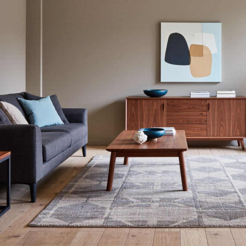
How to Create a Cohesive Look with Different Decor Pieces

Define a Unified Style, Color Palette, and Design Direction

A cohesive room begins with a clear design direction, not matching furniture. Choose three guiding words, such as warm, collected, and quiet. These words help evaluate every decor piece before it enters the room. I usually select one dominant color, one supporting shade, and one restrained accent. Repeat them through cushions, ceramics, artwork, and textiles. A limited palette creates visual rhythm without making the space feel staged.

Professional data supports this intentional approach. The 2023 Remodeling Impact Report from the National Association of Realtors found that 83% of consumers felt a greater desire to be home after remodeling. Comfort clearly matters. A 2024 U.S. home renovation study reported a median renovation spend of $24,000, making thoughtful coordination more practical than constant replacement. Use texture to add depth: pair a rough stone tray with brushed metal, linen, and softly patterned wood. Keep one finish imperfect.

Perfect coordination can feel lifeless. A slightly worn frame or uneven handmade bowl may provide necessary character. However, repeated shapes still matter. Echo a round mirror with circular objects on a nearby shelf, or repeat vertical lines through lamps and wall art. I sometimes overuse a favorite color. That mistake makes the room flatter. Step back, photograph the space, and remove one piece that competes with the main direction. Five minutes of distance can reveal more than another shopping trip.

Assess Each Decor Piece by Function, Scale, and Visual Weight

How to Create a Cohesive Look with Different Decor Pieces

Assess Each Decor Piece by Function, Scale, and Visual Weight

A cohesive room starts with purpose, not matching colors. I assess every decor piece by its job. A ceramic bowl may hold keys, display fruit, or simply add texture. If an item has no clear role, I question its place.

Scale keeps the arrangement comfortable. A large sofa needs substantial objects nearby, such as a broad floor lamp or a deep wooden table. Small accessories can disappear beside heavy furniture. I often group three modest objects on a tray, creating one readable visual unit. Leave breathing space. Crowded surfaces feel accidental.

Visual weight involves more than physical size. Dark finishes, dense materials, and sharp shapes attract attention quickly. A black metal frame may outweigh a pale, oversized vase. I balance that contrast with lighter textiles or open space nearby. Repeating one material can connect unrelated pieces, but repetition can become dull. A room needs a slight interruption.

Test the arrangement from the doorway and from a seated position. The view changes more than expected. I sometimes remove an attractive object after living with it for a week. It looked useful in isolation, yet distracted from the room’s main function. That small revision usually improves the composition. Not every empty corner needs decoration.

Layer Textures, Patterns, and Materials for Balanced Variety

A cohesive room does not require matching decor. It needs repeated visual signals. In my decorating projects, I begin with one steady element, such as warm wood or soft ivory. This creates a quiet base for more expressive pieces. I then choose two supporting colors and repeat them across cushions, artwork, and small objects. Repetition helps different materials feel intentionally connected.

Texture adds depth without making the room noisy. Pair a rough woven basket with a smooth ceramic vase and a brushed metal lamp. Keep their colors related. A patterned rug can anchor the space, while a smaller pattern on a cushion adds movement. Vary the scale carefully. Large geometric shapes should not compete with several equally bold prints. Sometimes, a plain linen throw is the most useful layer. It gives the eye somewhere to rest.

Material contrast also changes how a room feels. Glass reflects light, wool softens edges, and aged wood introduces warmth. I usually place heavier materials lower in the room and lighter pieces higher. The arrangement may still need adjustment after sunset. Artificial light can make beige look yellow and metal appear harsh. I once added too many glossy surfaces, and the room felt colder than expected. Removing one reflective object improved the balance. Leave a little space between contrasting pieces. Variety needs breathing room.

How to Create a Cohesive Look with Different Decor Pieces - Layer Textures, Patterns, and Materials for Balanced Variety

A practical room-planning reference for combining varied decor pieces while maintaining visual balance.

Decor Piece Typical Size or Quantity Primary Texture Pattern Scale Material Character Visual Weight Best Placement Cohesion Strategy
Neutral Upholstered Sofa 180–240 cm wide; 1 piece Soft, woven, low relief Solid or micro-texture Matte textile with a calm, continuous surface High Against the longest wall Use as the largest neutral anchor and repeat its color in smaller accessories.
Flat-Weave Area Rug 160 × 230 cm or 200 × 300 cm Firm, woven, slightly tactile Medium geometric or linear pattern Durable natural or synthetic fiber surface High Centered beneath the seating group Choose one pattern color that matches the sofa or nearby artwork.
Textured Throw 130 × 170 cm; 1–2 pieces Chunky knit, boucle, or brushed weave Solid or narrow stripe Soft textile with visible surface variation Low to medium Folded over an arm or seat corner Add tactile contrast without introducing another dominant color.
Patterned Accent Cushion 45 × 45 cm or 50 × 50 cm; 2 pieces Smooth or lightly woven Medium-scale botanical, stripe, or abstract motif Decorative fabric with defined edges Low Layered in front of plain cushions Repeat one or two colors from the rug while keeping the motif unique.
Wood Side Table 45–60 cm diameter or width; 1–2 pieces Smooth with visible grain No pattern or subtle grain pattern Warm, organic, and moderately matte Medium Beside the sofa or reading chair Balance soft upholstery with a warm hard material and repeat the wood tone elsewhere.
Ceramic Table Lamp 45–65 cm high; 1–2 pieces Hand-finished, matte, or lightly ribbed Solid color or fine linear detail Hard, grounded, and softly reflective Medium On a side table, console, or nightstand Echo the room’s accent color while varying the surface from wood and fabric.
Framed Wall Artwork 60–100 cm wide; 1 large piece or 3 smaller pieces Flat paper, canvas, or textured print Large-scale focal pattern Visual rather than tactile contrast Medium to high Centered above the sofa or console Use the largest pattern here, then repeat one quiet color in cushions or ceramics.
Glass Decorative Object 15–30 cm high; 1–3 pieces Smooth, transparent, or glossy No pattern or subtle translucent detail Light-reflective and visually delicate Low Grouped on a tray, shelf, or console Create breathing space among heavier wood, ceramic, and textile elements.
Metal Accent Tray 30–45 cm wide; 1 piece Smooth, brushed, or lightly hammered Plain or fine repeated edge detail Reflective, structured, and visually crisp Low to medium On a coffee table or ottoman Repeat the metal finish in a lamp, frame, or small hardware detail.
Indoor Plant in a Woven Basket 30–90 cm total height; 1–2 pieces Organic leaves and braided or woven fibers Natural irregular pattern Living, flexible, and naturally varied Medium to high Near a window or empty room corner Soften straight lines and connect the room’s neutral palette with natural green.
Balanced variety guideline: Keep approximately 60% of the room in quiet base textures, 30% in complementary materials or repeated colors, and 10% in distinctive patterns or high-contrast accents.

Arrange Focal Points and Repeated Elements to Guide the Eye

A cohesive room does not require matching decor. It needs a clear visual rhythm. Start with one anchor, such as a large artwork, sculptural lamp, or textured rug. This focal point should attract attention without making every other piece compete.

Arrange supporting objects along a gentle visual path. A low console can lead the eye toward a tall plant, while repeated colors connect the two areas. Repeat one or two materials, such as warm wood and brushed metal, across the room. Keep it visible. A small ceramic vessel, framed print, or cushion can echo the focal point without copying it exactly.

Scale matters as much as color. Place larger forms near the main anchor, then reduce height gradually across nearby surfaces. This creates movement and prevents the room from feeling scattered. Odd groupings often look more natural than perfectly even displays, but spacing still needs intention. Leave breathing room between objects.

In rooms I have arranged, repetition worked best when it was subtle. Three similar shapes can feel considered; seven may feel forced. I once added too many dark accents, expecting stronger balance. Instead, the space became heavy. Removing two pieces restored the visual flow. Step back from the doorway and check where your eyes land. If they stop in several places at once, the arrangement may need less decoration, not more.

How to Create a Cohesive Look with Different Decor Pieces

Arrange Focal Points and Repeated Elements to Guide the Eye

This measured example combines the physical width of each decor element with its repetition count. A single large focal piece establishes visual priority, while repeated cushions and lamps create rhythm that naturally leads the eye across the room.

Refine the Room Through Proportion, Spacing, and Visual Balance

A cohesive room is not built by matching every object. It comes from controlling proportion, spacing, and visual balance.

Start with the largest piece, such as a sofa or dining table, then measure smaller objects against it. A low table needs a grounded lamp, while a tall cabinet can support broader artwork. Leave visible breathing room around each focal piece. Crowded surfaces weaken even expensive decor.

The Environmental Protection Agency reports that people spend about 90% of their time indoors, so visual comfort deserves careful attention.

The 2023 Remodeling Impact Report from the National Association of Realtors gave interior painting a joy score of 10 out of 10. Color matters, but proportion decides whether that color feels calm or excessive.

Try repeating one visual weight, such as three dark accents across different heights.

Keep pathways clear, especially around chairs and entry points.

A practical rule is to preserve roughly 30 inches for main walkways, then adjust for real movement.

Perfect symmetry can feel staged. A slightly off-center arrangement often feels more lived-in.

I usually place the artwork first, then shift accessories by a few centimeters while viewing the room from the doorway. This process exposes mistakes quickly.

One object may still feel too small. That is useful information, not failure. Keep it, replace it, or give it more space.

FAQS

How can I make different decor pieces feel cohesive?

Start with each item’s purpose, not matching colors. Repeat two supporting colors across cushions, artwork, and small objects. A cohesive room still needs one unexpected interruption.

What should I do with decor that has no clear function?

Question its place. A bowl might hold keys, display fruit, or add texture. If it only fills space, remove it temporarily.

How does scale affect a room’s arrangement?

Match substantial furniture with objects of similar visual presence. A large sofa may need a broad lamp or deep wooden table nearby. Tiny accessories can disappear beside heavy furniture.

How can I organize small accessories without creating clutter?

Group three modest objects on one tray. This creates a clear visual unit. Leave visible space around it. Crowded surfaces can feel accidental.

What does visual weight mean in interior styling?

Dark finishes, dense materials, and sharp shapes attract attention quickly. A black frame may feel heavier than a pale, oversized vase. Balance it with light textiles or nearby open space.

How can I combine different textures successfully?

Pair a rough woven basket with a smooth ceramic vase and a brushed metal lamp. Keep their colors related. Texture should add depth, not visual noise.

How should I use patterns without overwhelming the room?

Vary pattern scale carefully. Let a patterned rug anchor the space, while a smaller cushion pattern adds movement. A plain linen throw can give the eye a quiet resting place.

Why should I check decor under different lighting conditions?

Artificial light can make beige appear yellow and metal look harsh. Review the room after sunset, from the doorway and from a seated position. My own arrangements sometimes need revision.

Should every empty corner contain decoration?

No. Empty space can protect the room’s main function and improve visual balance. I once removed an attractive object after one week. It looked useful alone, but distracted from the room.

Conclusion

Creating a cohesive room does not mean choosing identical decor pieces; it means giving every item a clear relationship to the overall design. How to create a unified look with different decor pieces begins with defining a consistent style, color palette, and design direction. From there, evaluate each piece by its purpose, size, shape, and visual weight so the room feels intentional rather than crowded. A large statement object should be balanced with simpler accents, while functional items should support both comfort and appearance.

Balanced variety comes from layering different textures, patterns, and materials without losing visual harmony. Arrange focal points and repeat selected colors, shapes, or finishes to guide the eye naturally through the space. Finally, refine the arrangement by adjusting proportions, spacing, and visual balance. Small changes in placement can make the room feel more open, connected, and polished while allowing each decor piece to contribute to a unified overall look.

Oliver

Oliver

Oliver is a seasoned marketing professional with a wealth of expertise in driving brand awareness and engagement. With a deep understanding of our company's product offerings, he consistently delivers high-quality content that enriches our professional blog. His insights not only shed light on......