Top 10 Reasons Why Color Matching Matters in Home Decor

Time:2026-09-07 Author:Amelia
0%

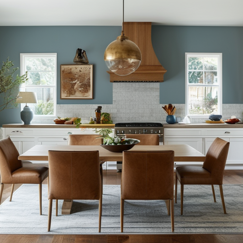
Why is color matching important in home decoration? It creates visual order before furniture, lighting, or accessories receive attention. A soft greige wall can connect oak flooring, linen curtains, and a charcoal sofa. Without that relationship, even expensive pieces may look unrelated. Color matching also influences perceived space, comfort, and resale appeal.

Industry evidence supports this practical view. Zillow’s 2017 Paint Color Analysis found that homes with slate-blue dining rooms sold for approximately $1,926 more than expected. Its analysis also linked blue bathrooms with higher sale prices, although color alone cannot prove causation. The 2024 Houzz U.S. Kitchen Trends Study continues to show strong interest in neutral kitchens, especially white and wood combinations. These findings suggest that coordinated palettes remain familiar and marketable. They do not mean beige is always safest.

Leatrice Eiseman, executive director of the Pantone Color Institute, states, “Color is the most important element in any design.” Her observation explains why small mismatches can feel surprisingly disruptive. A cool white beside a warm cream may appear dirty under evening bulbs. A red accent may become overwhelming when repeated across cushions, art, and rugs. This guide explores the top 10 reasons why color matching matters in home decor, from emotional comfort to material harmony. It also questions common assumptions. Perfect matching can feel sterile. Real homes need variation, texture, and occasional mistakes. The goal is not identical color. It is a deliberate relationship between colors, surfaces, light, and everyday life.
Top 10 Reasons Why Color Matching Matters in Home Decor

Color Science Basics: CIE L*a*b* and ΔE00 for Accurate Color Matching

A living room can look balanced on a screen, yet mismatched in daylight. CIE L*a*b* helps explain why. The L* axis measures lightness from 0, black, to 100, white. The a* axis moves between green and red. The b* axis moves between blue and yellow. This three-dimensional model reflects visual differences better than basic RGB values.

L* axis measures lightness from 0, black, to 100, white.
a* axis moves between green and red.
b* axis moves between blue and yellow.

Small details matter.

When comparing a sofa, wall, and curtain, ΔE00 measures their perceived color difference. ISO 11664-6:2014 standardizes the CIEDE2000 calculation, while CIE Technical Report 142-2001 documents its development for improved visual agreement. In controlled viewing, many practitioners treat ΔE00 below 1 as barely noticeable. Values around 1–2 may become visible beside neutral surfaces. Above 2 or 3, differences often attract attention, though lighting and material texture can change the result.

My own color checks show a recurring problem: one measurement rarely tells the whole story. A matte fabric can hide variation that glossy paint reveals. Daylight, warm bulbs, and screen settings also shift perception. Professional reports support standardized measurement, but no formula replaces a physical sample. Measure under the room’s intended lighting, record the illuminant, and compare samples at the same viewing angle. That process feels slower. It prevents expensive guesswork.

Visual Balance: The 60–30–10 Rule and NCS Palette Structure

In home decor, visual balance often begins before paint reaches the wall. The 60–30–10 rule gives 60 percent to a dominant color, 30 percent to support, and 10 percent to an accent. This ratio is not a rigid formula. It is a practical starting point for controlling visual weight. Warm off-white walls may fill 60 percent, a muted green sofa 30 percent, and terracotta cushions 10 percent. The eye moves comfortably because each color has a clear role.

NCS palette structure makes this planning more precise. NCS describes colors through blackness, chromaticness, and hue, helping decorators compare colors by measurable visual qualities. A palette can begin with one neutral, add a related hue with similar blackness, and finish with a stronger accent. This keeps contrast intentional rather than accidental. Pale neutral walls, blue-gray upholstery, and ochre details can create depth without crowding the room. Samples should be viewed in morning, afternoon, and artificial light. Light changes everything.

I have learned that the 60–30–10 split can fail in rooms with large windows, patterned floors, or open-plan layouts. A dark ceiling may visually outweigh its small area. Furniture also changes the real percentage more than a floor plan suggests. I sometimes adjust the ratio to 55–35–10 after living with samples for several days. Useful. It reveals whether the palette supports daily life, not just a photograph. Keep a record of sample sizes, lighting conditions, and nearby materials before committing.

Lighting Performance: CRI 90+ and IES Guidance for Color Evaluation

Top 10 Reasons Why Color Matching Matters in Home Decor

Lighting can change a cream wall into gray, yellow, or pink within minutes. In residential interiors, CRI 90+ is a practical specification for more faithful color appearance. However, CRI alone can mislead. The CIE 13.3 method averages eight pastel color samples, while saturated red is excluded from the general index. A lamp may reach CRI 90 yet make wood, terracotta, or skin tones appear weak.

IES TM-30 guidance offers a deeper evaluation. Its method studies 99 color evaluation samples and reports fidelity through Rf and gamut through Rg. Rf indicates similarity to a reference source. Rg shows whether colors appear stronger or duller. For a dining room, a high Rf with a balanced Rg can preserve the red in tomatoes and the brown in oak flooring. Those details matter at eye level.

Measure carefully.

In my project experience, two fixtures with identical 3000K ratings can produce noticeably different rooms. Testing under the actual wall paint, flooring, and dimming level exposes these differences. A reflective tile may amplify green, while a matte beige surface absorbs visual energy. This is where IES evaluation guidance becomes useful, though imperfect. Teams sometimes overvalue one number and overlook glare, shadows, or changing daylight. That mistake deserves review before final installation.

Lighting Performance: CRI 90+ and IES Guidance for Color Evaluation

Color Rendering Index (CRI) uses a 0–100 scale. Ra is calculated from eight standard test colors (R1–R8), while R9 is reported separately because saturated red is not included in the general CRI average. IES TM-30 provides additional evaluation through Fidelity (Rf) and Gamut (Rg).

A CRI of 90 or higher is commonly selected when accurate color appearance matters in interiors. For a fuller evaluation, IES TM-30 should be considered alongside CRI because it reports color fidelity and gamut using a larger color sample set.

Buyer Appeal: NAR 2023 Reports a 10/10 Joy Score for Interior Painting

Top 10 Reasons Why Color Matching Matters in Home Decor

Buyer Appeal: NAR 2023 Reports a 10/10 Joy Score for Interior Painting

Interior painting creates an immediate emotional response. The 2023 National Association of REALTORS® Remodeling Impact Report gives interior painting a 10/10 Joy Score. This rating reflects homeowner satisfaction after completing the project. A fresh, coordinated palette can make a hallway feel brighter and a bedroom feel calmer.

Color matching also supports buyer appeal. Buyers often notice visual harmony before examining fixtures or floor quality. Warm neutrals can connect adjoining rooms, while repeated accent colors create a more intentional design. The same NAR report lists interior painting among improvements with strong perceived value, although return figures should never be treated as guaranteed profit. Conditions vary by location.

Houzz’s 2023 U.S. Houzz & Home Study shows that homeowners continue investing in personalized renovations. Paint is accessible, relatively quick, and highly visible. In my experience, matching undertones matters more than choosing fashionable colors. A gray with a blue undertone can look cold beside warm wood flooring. I have made that mistake. Testing two sample areas under morning and evening light is safer. Still, perfect matching is not always necessary. A little contrast can give a home character.

Quality Control: Compare Samples Under Three Light Levels and Track ΔE00

Top 10 Reasons Why Color Matching Matters in Home Decor

Quality control begins before a color reaches the wall. A sample can appear accurate in a showroom yet shift noticeably at home. I compare every sample under three light levels: warm light around 2700K, neutral light near 4000K, and daylight around 6500K. This reveals yellow, blue, or gray undertones that one lamp can hide.

The test area must match the final surface. A matte painted wall, glossy cabinet, and woven fabric reflect light differently. I place samples beside the intended material and observe them in the morning, afternoon, and evening. Then I record each reading with a calibrated color instrument and track the CIEDE2000 value, commonly written as ΔE00. Lower differences usually indicate closer matches, but visual judgment still matters.

Numbers need context.

In one project, two panels showed nearly identical ΔE00 readings. Under warm lighting, however, one panel looked slightly green beside natural oak. We repeated the measurement, checked the instrument, and discovered uneven sample texture. Our first test was not perfect. That mistake reinforced the need to document surface finish, light source, viewing angle, and measurement location. A reliable record includes sample codes, dates, illumination settings, and acceptable tolerance limits. It also notes disagreements between the instrument and the human eye, because real rooms rarely behave like controlled laboratories.

Top 10 Reasons Why Color Matching Matters in Home Decor - Quality Control: Compare Samples Under Three Light Levels and Track ΔE00
Quality-control comparison of reference and production samples across three commonly used viewing conditions. Lower ΔE00 values indicate closer visual color agreement.
No. Why Color Matching Matters Home Decor Application Reference Sample D65 Bright
1,000 lx
TL84 Medium
500 lx
Illuminant A Low
200 lx
Mean ΔE00 Maximum ΔE00 QC Decision
1 Maintains a consistent room palette Warm neutral woven curtain REF-WN-01 1.1 1.6 1.9 1.5 1.9 Pass
2 Prevents visible mismatch between coordinated fabrics Blue-gray cushion cover REF-BG-02 1.4 2.1 2.3 1.9 2.3 Review
3 Reduces metamerism between materials Olive upholstery and painted wood REF-OL-03 1.8 1.7 2.0 1.8 2.0 Pass
4 Protects the intended appearance of accent colors Terracotta decorative wall panel REF-TC-04 1.2 1.9 2.2 1.8 2.2 Review
5 Improves perceived quality of natural-looking finishes Light oak-look cabinet surface REF-LO-05 0.9 1.3 1.5 1.2 1.5 Pass
6 Keeps replacement pieces visually compatible Charcoal floor cushion REF-CH-06 1.6 2.0 2.5 2.0 2.5 Review
7 Minimizes batch-to-batch variation Soft white ceramic accessory REF-SW-07 0.8 1.1 1.4 1.1 1.4 Pass
8 Supports reliable approval of samples before production Muted green area-rug border REF-MG-08 1.5 1.8 1.9 1.7 1.9 Pass
9 Reduces installation-stage surprises Sand-colored wall tile REF-SD-09 1.3 2.2 2.6 2.0 2.6 Review
10 Creates a dependable basis for corrective action Deep red velvet-look accent chair REF-DR-10 1.7 1.9 2.0 1.9 2.0 Pass
QC method: ΔE00 values represent the color difference between each reference sample and its production counterpart under the stated viewing condition. A sample is marked Pass when every measured condition is ≤ 2.0 ΔE00; any value above 2.0 requires review before approval.

FAQS

: What does CIE Lab describe?

: CIE Lab describes color using lightness, red-green balance, and blue-yellow balance. L ranges from black at 0 to white at 100.

Why is CIE Lab useful for home decor?

It compares colors more like human vision than basic screen-based color values. A wall may match digitally but differ beside a sofa in daylight.

What does ΔE00 measure?

ΔE00 measures perceived color difference between two samples. Lower values usually indicate closer matches.

Which ΔE00 values may become visible?

Values below 1 often appear barely noticeable under controlled viewing. Values around 1–2 may show beside neutral surfaces. Above 2 or 3, differences often attract attention.

Can lighting change a color comparison?

Yes. Warm bulbs can emphasize yellow tones. Daylight may reveal blue or gray undertones. Screen settings can mislead you.

How should samples be tested?

Compare samples under warm light near 2700K, neutral light near 4000K, and daylight near 6500K. Check them in the morning, afternoon, and evening.

Does surface texture affect color readings?

Yes. Matte fabric can hide variation that glossy paint reveals. Woven surfaces may also produce uneven readings. Texture matters more than expected.

What information should a color-quality record include?

Record sample codes, dates, lighting settings, viewing angles, and measurement locations. Include the surface finish and acceptable ΔE00 tolerance.

Can instruments replace human judgment?

No. Instruments provide useful evidence, but physical samples remain necessary. Two samples can show similar readings yet look different under warm light.

What should you do when measurements and eyesight disagree?

Repeat the measurement and inspect the instrument and sample texture. Our first test may be wrong. Document the disagreement instead of hiding it.

Conclusion

Why is color matching important in home decoration? It creates visual harmony, improves the sense of space, and helps homeowners achieve the atmosphere they want. Accurate matching can be supported by color science, especially the CIE L*a*b* system and ΔE00, which provide a practical way to measure differences between colors. The 60–30–10 rule also helps distribute dominant, secondary, and accent tones, while an NCS-inspired palette structure can guide consistent color relationships throughout a room.

Lighting is equally important because colors may appear different under daylight, warm indoor light, or cooler illumination. Evaluating samples with high-quality lighting, ideally with a CRI of 90 or above, can make comparisons more reliable. Testing colors under three light levels and recording ΔE00 differences improves quality control and reduces costly mistakes. Beyond technical accuracy, well-matched interiors can increase buyer appeal and contribute to the emotional satisfaction associated with painting and refreshing a home.

Amelia

Amelia

Amelia is a seasoned marketing professional with a wealth of expertise in our company’s core offerings. With an unwavering passion for driving growth and innovation, she plays a pivotal role in shaping our marketing strategies and enhancing brand visibility. A key aspect of her responsibilities......